

Redesigning Dental Uni’s digital ecosystem
An end-to-end redesign of the digital ecosystem of one of Brazil’s largest dental plan providers, spanning its corporate website, member dashboard, and mobile app.
- Team
- Auclan Design
- Client
- Dental Uni
- Role
- Product designer
- Year
- 2024-2025
Context
Dental Uni has operated in Brazil’s dental care market for more than 40 years. Its digital presence, however, had grown incrementally: every product and channel was created at a different moment, with its own logic and visual language.
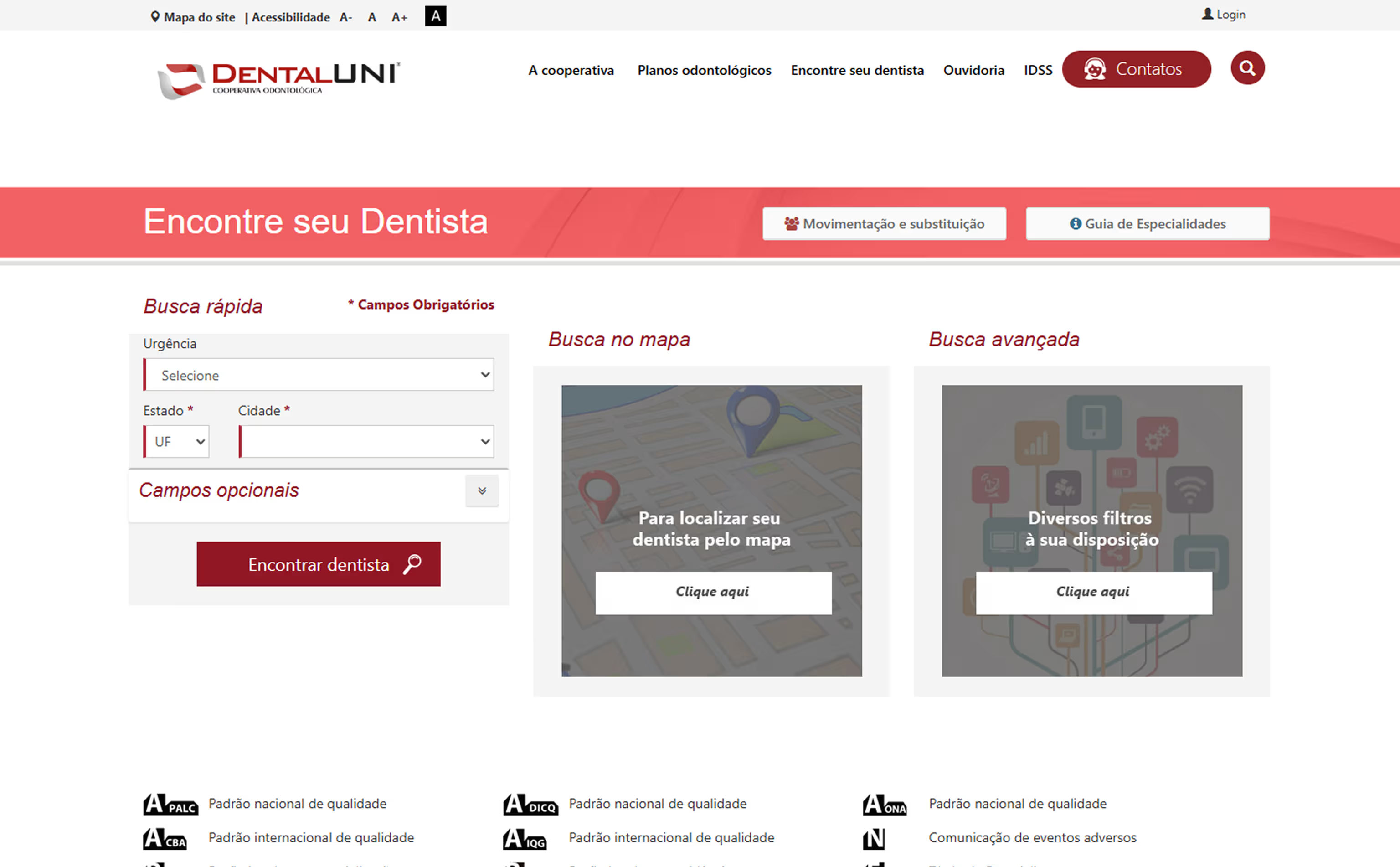
This fragmented evolution created an inconsistent ecosystem and made key post-purchase journeys difficult. First access, finding a dentist, and locating basic information were confusing enough that customers frequently relied on human support, increasing operational load and weakening the overall experience.
Discovery gave the team an opportunity to rethink the ecosystem as a whole. We connected previously isolated products, simplified critical journeys, and brought high-value tasks to the foreground, including finding dentists, managing corporate beneficiaries, and accessing essential information.
Starting point
The research involved Dental Uni’s four primary user groups and explored the behaviors, needs, and problems each encountered across the company’s digital touchpoints.
Despite their different profiles, a consistent pattern emerged: people visited the platform to solve specific needs, yet repeatedly encountered the same barriers around findability, performance, and usability.
Objective
The mission carried significant responsibility: revitalizing the primary digital touchpoints between one of Brazil’s largest dental plan providers and its members, brokers, and dentists. The work converged around three objectives:
Make the provider network central
The provider network connected every user group. Finding a dentist needed to become a more efficient, trustworthy experience aligned with the expectations of everyone involved.
Simplify navigation
Organize information and flows so people can find resources and complete tasks with less effort.
Create a consistent visual language
Build a coherent experience across digital touchpoints, making interactions predictable for users and easier for the engineering team to maintain.
Website
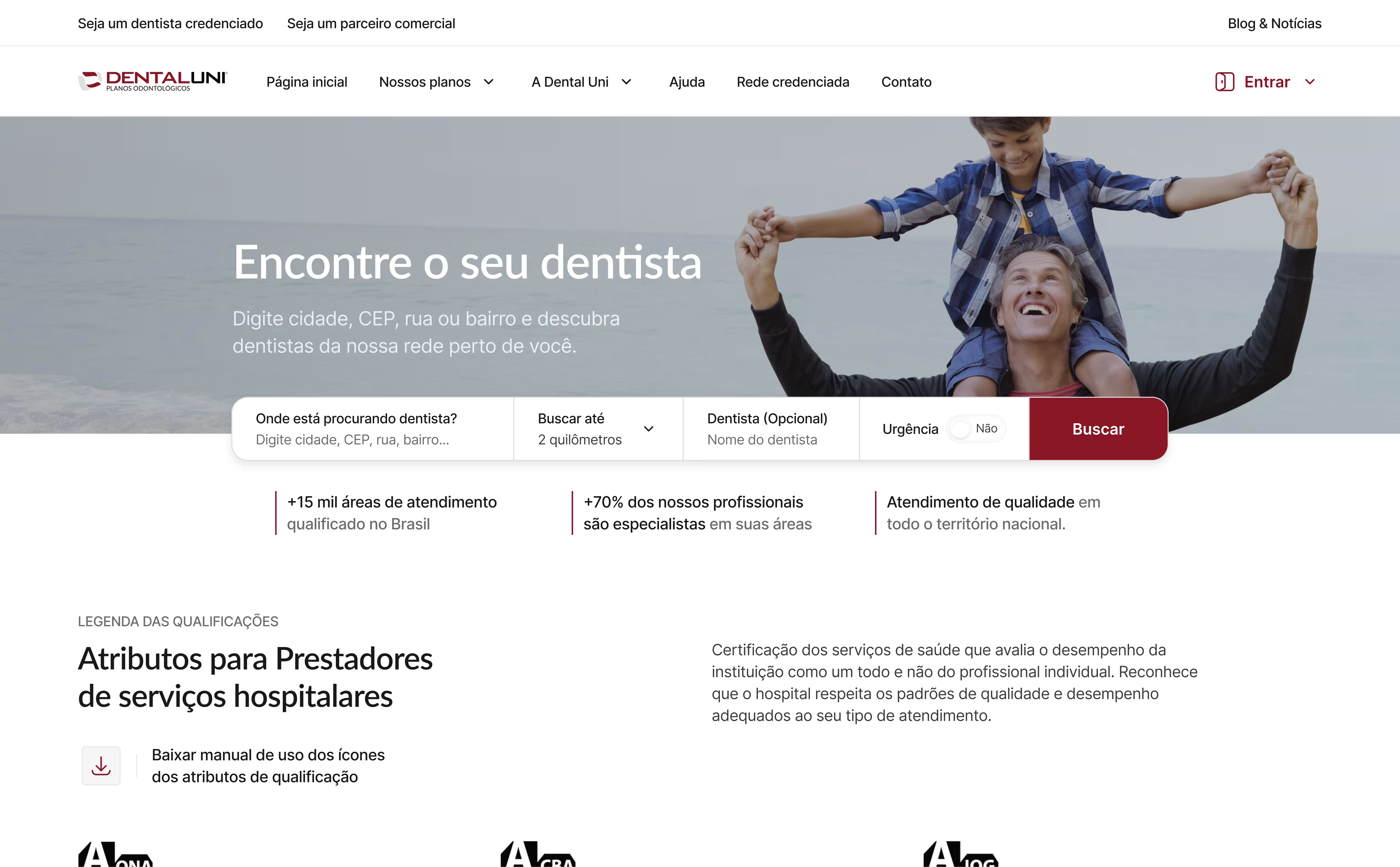
Research and validation surfaced several decisions that became fundamental to the final solution. A mega menu and dedicated pages for each audience reorganized the information architecture and made relevant content and features easier to find.
We also created a centralized Help hub for support needs. One of the most important journeys, finding a dentist, was redesigned from its core behavior through to its usability and presentation.
Closing thoughts
This case study captures only a small portion of the decisions made over two years of intensive work. I contributed end-to-end across the ecosystem alongside one Product Owner, one Product Manager, and five developers. It was a complex project shaped by shifting constraints, and one I am proud to have helped build.